Archive for the 'CMS' Category

Simple Functional Sniffer & Switch Alternative

mix Because PHP is a server-side language, you will have times that you need to rely on client-side languages like CSS, JavaScript and even HTML5 to accomplish certain tasks. In developing the CMS, I realized that while incorporating JavaScript, CSS and HTML5 in heredoc strings, I’d established a barrier between PHP and everything else by only allowing these other languages to interact with PHP through objects. Of course, this is because PHP has emerged into an OOP language and the others have not.

What I failed to take into account is the fact that it’s perfectly possible for OOP structures to interact with non-OOP structures. To some extend that has been done with HTML/CSS UIs and PHP design patterns in several examples. That seems to work out fine, but where you want to use dynamic variables for more responsive HTML pages, we’re back to encapsulating HTML (along with Javascript and CSS) into heredoc strings in PHP. There’s nothing wrong with that, and there’s much to be said for having a fully integrated OOP design pattern with a pure PHP engine.

A Simple Functional JavaScript Sniffer

The problem I discovered in a pure PHP design is that other design possibilities are overlooked. The primary style tool for HTML documents is CSS, and the media queries in CSS3 are designed to be responsive to different devices—namely, those brought about by mobile computing. Sometimes (and I do mean sometimes) that solution seems to work fine. Other, times, however, the media queries fail to capture that chunk of CSS3 code that formats for the desired device. On top of that, it can be difficult calling up certain jQuery mobile files—or any other files—from CSS alone. In many ways, libraries in jQuery have proven to be far more robust than CSS3 alone and far easier to deal with. In several respects, probably in most, neither CSS nor jQuery mobile are programming so much as they are styling tools. As such, they’re the tail of the programming dog. This is not to say they’re less important; they’re just not programming.

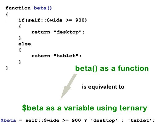
So, to sort out the devices looking at our pages, (moving away from CSS media queries) is a programming task. In several other entries on this blog, I’ve looked at ways to sniff through the possible devices, and I think we need to conclude once and for all that user-agents are next to useless. So, by exclusion, we’re left with screen width. So,begin by looking at this simple JavaScript sniffer using two lambda functions:

?View Code JAVASCRIPT
//Save as file name "jsniff.js"
var wide = screen.width;
var beta=function() {wide >=900 ? window.location.href="Desktop.html" :  window.location.href="Tablet.html";};
var lambda=function() {wide <= 480 ? window.location.href="Phone.html" : beta();};

In past posts I’ve used the Chain Of Responsibility (CoR) design pattern to do the same thing using either user agents (forget about it!) or width determined by a JavaScript object. The little JavaScript lambda functions do the same thing, and while at some point of granularity your may wish you had your CoR pattern, generally, I think that there’s enough with the three general categories at this point in time to deal with multiple device. Use the buttons to test the functions. (Try it with your phone and tablet too.) Click PlayA for the sniffer and PlayB for the PHP functional alternative to the switch statement. The download button downloads the source code for both.

PlayAPlayBDownload

The process is pretty simple both from a programming and a lambda calculus perspective. From lambda calculus we get following definitions of true and false:

true := λx.λy.x
false := λx.λy.y

As algorithms, we might consider the following:

function(x, y) {return x;};
function(x, y) {return y;};

So, that means:

function (10,20) = 10; ← true : Is 10
function (10,20) = 20; ← false : Not 10

That’s not exactly lambda calculus, but it’s along those lines that we can eke out an idea. (If you’re thinking, “What about function(10,10) that would appear to be both true and false,” you see what I mean.)

So now we’ll add the values a and b and reduce it:

((λx.λy.x) a b) -> ((λy.a) b) -> a

That replaces λx with (λy.a) b and then a. So a is a. Well, it sounds true!

Then for false we have:

((λx.λy.y) a b) -> ((λy.y) b) -> b

In looking at this, we see that if a is a its true; otherwise it’s b which is not true. That’s pretty much like if-then-else. If true a, otherwise it’s b.

So the line in JavaScript would be a ternary:

lambda = function(a) { return a ? a : b ;};

as well as in PHP,

$lambda = function($a) { return $a ? a : $b ;};

For now, that’s enough linking up lambda calculus with Internet languages. With our JS “sniffer” using a simple HTML call, we can get the page configuration we want for our device based on the window size:

?View Code HTML5

        
                Functional Sniff


Try it out. It’s easy to write and it’s practical. What’s more, you can see how close everything is to a Boolean type decision. (The different device HTML5 files are in the materials in the download package; one of which uses the jQuery Mobile formatting.)

I Don’t Need No Stinkin’ Switch Statement

One of the nice things about functional programming is that it made me re-think how I was programming. One of the areas where I thought I’d be able to boil down an algorithm to something more compact came when I decided to break down a calendar output into four weekly segment. Using a jQuery calendar, I could pick a day and pass the information to a PHP class for processing. Initially, the switch statement came to mind as a solution in something like the following:

$d=$this->numDay;
switch ($d)
       {
         case ($d >=1 && $d<=7):
            return "jquery";
            break;
        case ($d> 7 && $d<= 14):
            return "haskell";
            break;
        case ($d> 14 && $d<= 21):
            return "php";
            break;
        default: return "racket";
       }

In looking for a range, each case acts like a little function. So why not use lambda functions in PHP to do the same thing. Each query (case/function) either returns a value or goes on to the next case. Here’s what it looks like:

$gamma=function($d) {return $d > 14 && $d <= 21 ? "php" : "racket";};
$beta = function($d) use ($gamma) {return $d > 7 && $d <= 14 ? "haskell" : $gamma($d);};
$lambda = function($d) use ($beta) {return $d >=1 && $d <=7 ? "jquery": $beta($d);};
return $lambda($this->numDay);

The last used lambda function is the first in the list ($gamma). That’s because in order for the subsequent function to call them with the use statement, the function used must be defined before the one using it. In functional programming, the use of one function by another is referred to as a closure.

The Language Mix-Master

With the key parts in place, take a look at the different parts and languages used. First of all, the program begins with an HTML5 UI. It links to the jQuery UI JavaScript files and the CSS files. A further stylesheet links to the local CSS.

?View Code HTML


  jQuery UI Datepicker - Default functionality


Language of the Week

Click in the text box to select from pop-up calendar:

Date:

A form links to a PHP file where it passes the selected datepicker() value. The iframe tag provides a visual feedback embedded in the HTML page. (Note: Remember, with HTML5, iframes are no longer evil.)

Finally, using a single PHP class, the selected date is reconfigured to an integer and evaluated by the lambda functions described above in lieu of a switch statement:


error_reporting(E_ALL | E_STRICT);
ini_set("display_errors", 1);
 
class LangWeek
{
    private $dateNow,$dayMonth, $numDay;
 
    public function __construct()
    {
        $this->dateNow = $_POST['pick'];
        $this->dayMonth=substr($this->dateNow, 3,2);    // Start 03  : 2Length
        $this->numDay = intval($this->dayMonth);
        echo "";
    }
 
    private function chooseLanguage()
    {
        $gamma=function($d) {return $d > 14 && $d <= 21 ? "php" : "racket";};
        $beta = function($d) use ($gamma) {return $d > 7 && $d <= 14 ? "haskell" : $gamma($d);};
        $lambda = function($d) use ($beta) {return $d >=1 && $d <=7 ? "jquery": $beta($d);};
        return $lambda($this->numDay);
    }   
}
$worker = new LangWeek();
?>

Fortunately the jQuery date picker passes the date as a consistent string mm/dd/yyyy, and so the only requirement is to use a substring to find the day of the month and convert it to an integer. This is passed to the chooseLanguage() method that employs the lambda functions.

Mixing it Up

While this blog is dedicated to PHP Design Patterns and their application, I believe that PHP programmers should explore beyond OOP and try out different kinds of programming within an OOP framework, which happily exists within a Design Pattern. The willingness to explore and experiment keeps programming fresh and interesting in any language.

Sandlight CMS IV: Dynamic Responsive Web PHPages

responsiveAt this point in the Sandlight CMS development process, two design patterns have been employed: 1) Chain of Responsibility as a device checker, and 2) Abstract Factory for making different parts for different devices. As usual, I’ve been posting the results so far on the Sandlight Productions, LLC website. The site itself is the example used in this series. This post is Part IV of the Sandlight CMS series, and if you have not been following the series you can review what has been done so far beginning with Part I.

At this stage, the project is ready to use the Abstract Factory to produce the needed parts and put them together into a page. However, before going ahead and have the factory build the parts I’d like to take an intermediate step and just build a dynamic responsive Web page.

The Dynamic Responsive Web PHPage

The easiest way to proceed is to begin with an HTML5 page, encapsulate the page into a PHP object (class) and add methods. The reason for this step is that the Web site, in addition to being responsive, needs to be dynamic. This means that it needs a way for the administrator to add changes, and in order for this to transpire, the dynamic portion of the page has to include variables in the place of static text, graphics and/or video. Figure 1 shows the general layout envisioned for the page:

Figure 1: Dynamic Responsive Web Page

Figure 1: Dynamic Responsive Web Page

Everything about the page must be responsive, but some parts are static and some are dynamic. In the two-column outline in Figure 1, the entire left column is static yet it must be responsive to different devices. In Parts I to III of this series, the pages have been responsive. The next step in making them both responsive and dynamic is to create parts of the page that will be dynamic since they are already set up to be responsive. Before continuing, click the Play button to see the progress so far and the Download button for all of the source code and accompanying files:
PlayDownload

Using PHP alone, creating a dynamic page is simple. Just place PHP variables where content goes. This is true for both the pages formatted by CSS3 and jQuery. Importantly, though, all of the Web pages should be encapsulated into PHP classes, using heredoc string variables as has been shown in previous installment of this series.

QR Code: The New Responsive Component

Quick Response Code (QR) is a new necessity for Web sites doing business on the Web and for just about every other kind of site that wants to increase its exposure. Basically, using a QR Code reader in a mobile device (phone or tablet) automatically brings up the link coded in the QR image (a square with some squiggly block images.) That beats trying to to thumb in a URL on a tiny phone keyboard. The following two can be downloaded free (at the time of this writing.):

sandlightqrcode
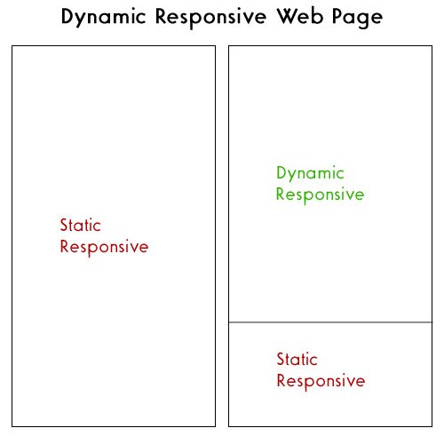
I’m pretty certain that other smart phones have QR readers; so if you have something other than an iOS or Android operating system on your mobile device, an Internet search for “QR Scanner” will probably be able to locate one for you.

sandlightOnce you have a QR scanner, you need a coded image, such as the one to your right. Go ahead and scan it to see what happens. It should take you to the Sandlight Productions, LLC home page build on this CMS (updated.) On it you will find several more QR codes for links to sites related to Sandlight. You can get the coded images online at different sites. One site allows you to include your logo and choice of colors is QRCode Monkey. The QR code image in green to your left with the Sandlight logo in the middle does exactly the same thing as the black one. So, if you’d like your QR Code images to keep your graphic designer happy, consider the visual options beyond the default. Figure 2 shows a page being scanned with an iPhone (left) and the linked page in the iPhone (right).

Figure 2: Scanned QR URL uploaded in mobile phone.

Figure 2: Scanned QR URL uploaded in mobile phone.

Adding QR codes to your site (or your client’s site) is very easy, and you should definitely include it in your dynamic responsive CMS. Let’s now see how the dynamic responsive two-column page is created:
Continue reading ‘Sandlight CMS IV: Dynamic Responsive Web PHPages’

Sandlight CMS III: PHP Abstract Factory

abfac
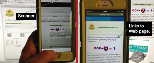
Note: This is the third in a series for developing a CMS for Sandlight Productions. Drop by the Sandlight site to see the progress so far, and be sure to check your country’s flag count!

Now that the CMS has a filter for different devices, it now needs a pattern to take care of those devices and different types of content that they will display. Previous posts on this blog used the Bridge pattern and the Factory Method pattern. However, another pattern might be more useful for all of the different things that a Content Management System (CMS) might do. A review of the series of posts on this blog for how to select a design pattern, shows the different criteria to consider. The CMS has to create different elements of a Web page for different devices and that fact must be the focal point of the consideration. The section head for Creational Patterns in Learning PHP Design Patterns, lists the Abstract Factory pattern as a creational one, but that pattern was not discussed in the book nor on this blog. It would appear to be just what this CMS needs.

The Abstract Factory Design Pattern

The Abstract Factory pattern has features for families of factories and products instead of individual factories as does the Factory Method pattern. In comparing the relatively simple Factory Method pattern with the Abstract Factory, the Abstract Factory has multiple abstract product interfaces with multiple concrete factories for the families of the products.

Figure 1 shows the the Abstract Factory class diagram, and when you look at it, try to focus on the fact that the pattern has two types of interfaces: Factory and Product. So, if you understand the Factory Method pattern, you have a starting point for appreciating the Abstract Factory:

Figure 1: Abstract Factory class diagram

Figure 1: Abstract Factory class diagram

Unlike the Factory Method pattern, the Abstract Factory includes a Client class as an integral part of the pattern. Further, the Client holds an association between both the AbstractFactory (AbsFactory) and the two AbstractProduct classes. So while it shares some of the basic Factory Method characteristics, it is clearly a different pattern than the Factory Method.

Since the Abstract Factory may appear to be daunting, the color-coded the product instantiations (dashed lines) in the file diagram (appearing in the Play window) help show where each concrete factory method calls. Experiment with different combinations of factories (devices) and products (page parts) and look at the diagram so that you can see the path. Phone instantiations are in green, Tablet in red, and Desktop in blue. Experiment with the different single products first, and then click the bottom button to see what different “pages” each device factory displays.

Implementing the Abstract Factory in PHP

To see how this implementation of the Abstract Factory design pattern works, click the Play button. You will see both the interactive Abstract Pattern tester and the of the file diagram of this implementation of the Abstract Factory for the evolving Sandlight CMS. Click the Download button to see all of the files in the diagram. For this particular post, downloading all of the files is more important than usual because there are lots of them, and rather than having listings for all in this write-up, I’ve just selected representative ones.
PlayDownload

In addition to the Abstract Factory file diagram (viewed when you click the Play button), the following quick overview of the participants’ roles and how the CMS implements the Abstract Factory explain how this implementation works:

Client client: Only uses interfaces declared by IAbFactory (interface) and IProducts (abstract classes IHeaderProduct, IImageProduct and ITextProduct.) This means that the Client can only use the classes and methods implemented from those two interface types—factory or products. In other words, it should not directly implement a product (a page element) by directly using a product independent of the factory and product interfaces. Figure 2 illustrates this point:

Figure 2: Client works through Abstract Factory implementations

Figure 2: Client works through Abstract Factory implementations

In going over the other participants below, keep in mind that the Client can only implement concrete implementations of the IAbFactory to request products (page parts for different devices.)

IAbFactory interface: Establishes the methods for the concrete factories.

  • PhoneFactory implements operations to create phone products
  • TabletFactory implements operations to create tablet products
  • DesktopFactory implements operations to create desktop products

IHeaderProduct: abstract class Establishes the method for concrete header products and adds protected property for returning completed product.

  • PhoneHeader defines phone object to be created by the PhoneFactory and
    implements the IHeaderProduct interface
  • TabletHeader defines tablet object to be created by the Tabletactory and
    implements the IHeaderProduct interface
  • DesktopHeader defines desktop object to be created by the DesktopFactory and
    implements the IHeaderProduct interface

IImageProduct: abstract class Establishes the method for concrete image and/or video products and adds protected property for returning completed product.

  • PhoneImage defines phone object to be created by the PhoneFactory and
    implements the IImageProduct interface
  • TabletImage defines tablet object to be created by the Tabletactory and
    implements the IImageProduct interface
  • DesktopImage defines desktop object to be created by the DesktopFactory and
    implements the IImageProduct interface

ITextProduct: abstract class Establishes the method for concrete text products and adds protected property for returning completed product.

  • PhoneText defines phone object to be created by the PhoneFactory and
    implements the ITextProduct interface
  • TabletText defines tablet object to be created by the Tabletactory and
    implements the ITextProduct interface
  • DesktopText defines desktop object to be created by the DesktopFactory and
    implements the ITextProduct interface

Comparing the above outline with the Abstract Factory file diagram (seen when you click the Play button) shows that the Abstract Factory is bound to the idea of a factory implementing a product. The specific classes (products) requested are never directly referenced by the Client; rather it is through a factory. The CMS application requires factories for the different device categories; Phone, Tablet and Desktop. Each factory should be able to build the necessary parts (products) for each device. In this case (and for this example) the products are a Header, Graphic and Text. Each factory can build its own version of the products; so requesting a header, for example, is through a concrete factory, and depending on which concrete factory the clients requests, it builds the appropriate product.
Continue reading ‘Sandlight CMS III: PHP Abstract Factory’

Sandlight CMS II : Mobile First!

mobileFirst
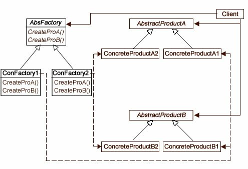
I’m not a graphic designer, and so I depend on others for the graphic elements and arrangement of my Web pages. However, I strive to make a site that is clear, easy to understand and useful. My focus is on good user experience (UX) and information design—clear communication with the user. In order to have good UX, you need to know something about , and if you don’t, check out the RWD link. Further, if you are unfamiliar with the approaches to RWD, I’m sold on the Mobile First approach, but possibly for different reasons than designers. Let me explain.

In designing my own site, my focus is on content categories, ease of maintenance, which includes updates and changes, and device flexibility. So I have to keep all of those in mind. I want PHP to handle regular updates by using content from a MySql database (the Content Management of CMS), and I need it to work on different devices. By tackling mobile first, I have to create a diamond-tipped focus on exactly what I want the user to view because even with the new “Phablets,” I’m not dealing with a lot of screen real estate. Currently, my old working mobile phone has a CSS resolution of 320 x 480, and my Phablet is 414 x 736. That’s less that 100 units different. (By CSS resolution, I’m referring to what CSS reads as far as screen width is concerned. See this table.)

Choosing the Devices

In an another sniffer program using a Chain of Responsibility (CoR) design pattern and a PHP user agent ($_SERVER['HTTP_USER_AGENT']) posted on this blog, the sniffer detected the user agent and then found the handler responsible for that agent. Now that user agents have been replaced by CSS screen width (as determined by a JavaScript function) for determining the device, we can use the same CoR pattern making the necessary changes. However, instead of getting real pages, we can use stand-ins that only have the roughest page content. All of the content will be encapsulated into PHP classes using heredoc strings. Near-future posts cover the mechanics of working out the MySql to provide dynamic content for the pages, along with other details necessary for the CMS. For now, though, the dummy pages will only contain enough material to demonstrate that each is appropriate for the selected device. Use the buttons below to see the current state of the CMS and download the files for this portion:
PlayDownload

Note that all devices can now access the Flag Counter. Where is your country on the Flag Counter? (See the note about the Flag Counter at the end of this post.)

Back to the Chain of Responsibility Pattern (CoR)

The CoR pattern is handy because it’s easy to update and change. For example, suppose that having three device categories (e.g., phone, tablets and desktops) proves to be inadequate and you want to add two more; one for laptops and another for phablets. It’s a simple matter to add to the chain and add device classes to handle the new devices. Figure 1 shows the first design pattern to be used in the CMS:

Figure 1: Chain of Responsibility Implementation

Figure 1: Chain of Responsibility Implementation

In Part I of this series, you can see how the device width and height is determined using a JavaScript closure (object) to pass the information to HTML and on to PHP. Since we only need to find the width, the JavaScript code has been slightly altered and placed in a separate file (deviceCatcher.js) in case it needs to be reused.

?View Code JAVASCRIPT
//deviceCatcher.js
function getWide()
{
        var wide = screen.width;
        return function()
        {
                return wide;
        }
}
var w = getWide();
//Send data to PHP class, CoRClient.php       
var lambdaPass= function() {window.location.href = "CoRClient.php?hor=" + w();};

The HTML file simply calls the closure function which passes the values to PHP:

?View Code HTML

        
                Device Catcher


The HTML file is a trigger to get the ball rolling with the client class (CoRClient).

Starting the Chain

The client pulls the viewing device’s width from the superglobal, and passes it to a PHP variable. Given the variability in the width of device screens, I made the decision to work with three sizes to get started: 1) phone, 2) tablet, and 3) desktop. So, depending on the width, the request would be handled by one of those three device groups. I used the following cutoff sizes:

  1. Phone: >= 480
  2. Tablet: >=481 and < 900
  3. Desktop: >= 900

I used this table as a guide, but cutoff points can be anything you want.

Getting the width from the superglobal is easy enough using a static variable:

self::$wide=$_GET['hor'];

The, using the cutoffs, the program needs to generate three strings, phone, tablet, and desktop to send to the Request class that stores the appropriate string. The most obvious way is to use conditional statements (if or switch) to generate the correct string for Request. For example an imperative algorithm such as the following would do the trick:

if(self::$wide < = 480)
{
        return "phone";
}
elseif (self::$wide >= 900)
{
        return "desktop";
}
else
{
        return "tablet";
}

However, a functional program would be more compact, and like the JavaScript closure used in Part I, it would be an “object.” Transformed into a functional closure, the operation would look like the following:

$beta = self::$wide >= 900 ? 'desktop' : 'tablet';
$lambda = function($x) use ($beta) {
        $alpha =  $x < = 480 ? 'phone' : $beta;
        return $alpha;};

Using ternary operations ?: , $alpha and $beta both have function-like qualities. for example, $beta could have been written as a function beta() as shown in Figure 2:

Figure 2: "Functional" variables

Figure 2: “Functional” variables

As you can see in Figure 2, $beta provides the same functionality as beta(), and $beta can be used as a reference in the $lambda function along with $alpha in a PHP closure. (For some reason, when $beta is assigned an anonymous function, I was unable to get it to be added as a closure in the $lambda anonymous function.)
Continue reading ‘Sandlight CMS II : Mobile First!’

Sandlight CMS I: Device Closures

devices
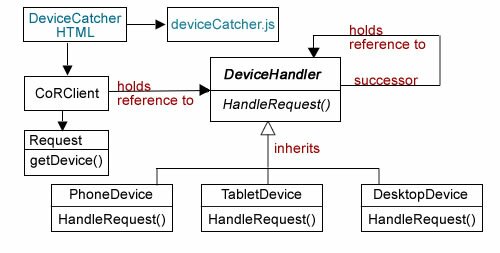
In previous posts on this blog, I’ve included PHP patterns that deal with the issue of creating sites for multiple devices. In developing a Content Management System (CMS) for my Sandlight site, I wanted to start from scratch and use both elements of OOP and design patterns as well as functional programming. (Functional programmers may furrow their collective brows and mutter You’re ruining FP, but there’re enough arguments among FP advocates, that I’m not overly concerned.)

The Problem with User Agents

The problem with user agents (UAs) such as $_SERVER['HTTP_USER_AGENT'] in PHP, is that the information they provide is insufficient. For example, if you get “trident” from a user agent, it could be anything from a Microsoft-based computer to a MS phone. Devices identified as “iPad” can be the iPad Minis or the full-size iPads. And of course, if you get “Android” or “iPhone,” it can be any size screen from the early smart phones to what some call “Phablets”— the big phones like iPhone 6+ and Galaxy Note 3. To get started, take a look at this table. Not only will that table give you a range of mobile devices, it provides the way in which browsers communicate the type of device currently reading a page. (The CSS column is the most relevant for setting up a CMS that will adjust to different devices.)

How Can You Get the Screen Size for PHP?

If you’ve used CSS3, you are familiar with CSS media queries where you can direct the CSS to different classes and IDs depending on the screen size. It’s just as easy using JavaScript. The built-in document properties, screen.width and screen.height can be passed to variables and in turn to PHP. The procedure is a simple one-line program:

?View Code HTML

The JavaScript variables are hor and vert and can retrieved in PHP using $_GET[‘hor’] and $_GET[‘hi’]. So while that code can be saved as an html file and pass the data to a PHP class, it also offers up an opportunity to demonstrate how to add functional programming (FP) to JavaScript and to use FP with OOP. Use the buttons to test the program on as many devices as you have to see the range of screen sizes. Download the complete file set as well:
PlayDownload

Instead of stopping here and announce Mission Accomplished, I’d like to consider functional programming in JavaScript and closures in particular. In order to understand why I think it’s important to do this, consider the general purpose of both OOP design patterns and functional programming. Both were developed to better organize programming so that larger programs (consider what goes into your favorite game program) can be developed, maintained and changed.

Hackers vs Programmers

Hackers and hacks have a history of unthoughtful and malicious programming. It takes talent to build a house, but none to burn one down. The term “hack” originated as a program created by programmers who just threw code at a problem until something worked. The problem with hacks and hackers is that while the short-term goals may be accomplished, especially with short programs, hacks are like a guy with a machete chopping his way through the jungle to make a trail. The next time he comes down the trail, it’ll be grown over, and he’ll have to hack a new path. Figure 1 illustrates creating a hack vs. creating a program:

Figure 1: Hacking vs. Programming

Figure 1: Hacking vs. Programming


Compared to a modern highway, where planning, use of structure and interactive cooperation can create something of lasting value, hacks are a one-time accomplishment. It’s a kid playing in the mud. Fun until he’s got to start cleaning his own clothes.

Functional Programming in JavaScript

As you probably know, JavaScript does not have classes per se, and so we’re not going to try to create an OOP class in JS. However, the JavaScript folks are fortunate in having the book, Functional JavaScript (O’Reilly, 2013) by Michael Fogus. Functional programming is an important framework to understand in both PHP and JavaScript, and you can find a number of articles and other works covering FP in JS in addition to the Fogus book.

The “objects” in FP are called closures. In variations on JS and in special FP libraries (e.g., Underscore.js) you can find more FP functionality just as in the Hack dialect of PHP has functional operations for PHP not found in standard PHP. However, for here, I’d like to stick to plain vanilla JS and create what Fogus referred to as a “closure simulators” (faux closures), but they serve the same purposes. (PHP also has closures and a built-in Closure class.) I tend to think of closures as FP “objects,” but that characterization has a number of fuzzy edges; however, it’s a convenient way to think about them. Fogus summarizes a closure

as a function that captures the external bindings (i.e., not its own arguments) contained in the scope in which it was defined for later use (even after that scope has completed.)

—Michael Fogus p. 60, Functional JavaScript (O’Reilly, 2013)

A bit more dramatic description by Fogus is,

Closures are the programming language equivalent of vampires—they capture minions and give them everlasting life until they themselves are destroyed. The only difference is that closures don’t sparkle when exposed to sunlight.
—Michael Fogus p. 61, Functional JavaScript( O’Reilly, 2013)

Unfortunately, the PHP manual describes closures as equivalent to anonymous functions or lambdas. Simon Holywell in Functional Programming in PHP (p. 33) clarifies the manual’s misconception by noting that PHP closures are functional structures that include the use clause. In any event, both Holywell and Fogus describe a type of “object” where data can be packaged and used elsewhere in a program. So let’s take a look at a closure in JavaScript:

?View Code HTML

        
                Passing Width & Height with Closure


The two functions, getWide() and getHi() are simulated closures, but functionally, they work just like closures. In fact, they work pretty much like objects. These two closures are passed to variables, w and h, which themselves are then closures and can be used to return the width and height of the device screen. Continue reading ‘Sandlight CMS I: Device Closures’