 At this point in the Sandlight CMS development process, two design patterns have been employed: 1) Chain of Responsibility as a device checker, and 2) Abstract Factory for making different parts for different devices. As usual, I’ve been posting the results so far on the Sandlight Productions, LLC website. The site itself is the example used in this series. This post is Part IV of the Sandlight CMS series, and if you have not been following the series you can review what has been done so far beginning with Part I.
At this stage, the project is ready to use the Abstract Factory to produce the needed parts and put them together into a page. However, before going ahead and have the factory build the parts I’d like to take an intermediate step and just build a dynamic responsive Web page.
The Dynamic Responsive Web PHPage
The easiest way to proceed is to begin with an HTML5 page, encapsulate the page into a PHP object (class) and add methods. The reason for this step is that the Web site, in addition to being responsive, needs to be dynamic. This means that it needs a way for the administrator to add changes, and in order for this to transpire, the dynamic portion of the page has to include variables in the place of static text, graphics and/or video. Figure 1 shows the general layout envisioned for the page:
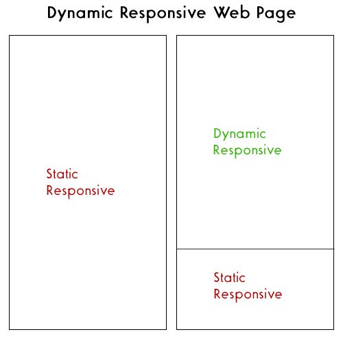
Figure 1: Dynamic Responsive Web Page
Everything about the page must be responsive, but some parts are static and some are dynamic. In the two-column outline in Figure 1, the entire left column is static yet it must be responsive to different devices. In Parts I to III of this series, the pages have been responsive. The next step in making them both responsive and dynamic is to create parts of the page that will be dynamic since they are already set up to be responsive. Before continuing, click the Play button to see the progress so far and the Download button for all of the source code and accompanying files:
Using PHP alone, creating a dynamic page is simple. Just place PHP variables where content goes. This is true for both the pages formatted by CSS3 and jQuery. Importantly, though, all of the Web pages should be encapsulated into PHP classes, using heredoc string variables as has been shown in previous installment of this series.
QR Code: The New Responsive Component
Quick Response Code (QR) is a new necessity for Web sites doing business on the Web and for just about every other kind of site that wants to increase its exposure. Basically, using a QR Code reader in a mobile device (phone or tablet) automatically brings up the link coded in the QR image (a square with some squiggly block images.) That beats trying to to thumb in a URL on a tiny phone keyboard. The following two can be downloaded free (at the time of this writing.):
 I’m pretty certain that other smart phones have QR readers; so if you have something other than an iOS or Android operating system on your mobile device, an Internet search for “QR Scanner” will probably be able to locate one for you.
 Once you have a QR scanner, you need a coded image, such as the one to your right. Go ahead and scan it to see what happens. It should take you to the Sandlight Productions, LLC home page build on this CMS (updated.) On it you will find several more QR codes for links to sites related to Sandlight. You can get the coded images online at different sites. One site allows you to include your logo and choice of colors is QRCode Monkey. The QR code image in green to your left with the Sandlight logo in the middle does exactly the same thing as the black one. So, if you’d like your QR Code images to keep your graphic designer happy, consider the visual options beyond the default. Figure 2 shows a page being scanned with an iPhone (left) and the linked page in the iPhone (right).
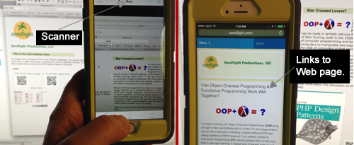
Figure 2: Scanned QR URL uploaded in mobile phone.
Adding QR codes to your site (or your client’s site) is very easy, and you should definitely include it in your dynamic responsive CMS. Let’s now see how the dynamic responsive two-column page is created:
Two-Column Page
The desktop and tablet pages will have a two-column design with the top right portion being dynamic. The mobile phone version will have a single column in a jQuery menu where the “Whats New?” menu containing the dynamic content. Keep in mind that all dynamic content is handled by the Abstract Factory; so for the time being, we do not have to concern ourselves with it. Instead, take a look at the CSS used to create a two-column page:
@charset "UTF-8"; /* CSS Document */ /*Sandlight CoR/Abstract Factory CMS 008844 (sandlight green) ; 8AA54E (almost avocado); F5AF4D (dusty gold); eee (whiteish) ; 000(black) */ body { font-family:Verdana, Helvetica, Arial, sans-serif; background-color: #eee; color: #000 ; margin-left: 20px; font-size: 16px; } /* Two column setup */ .col { display: block; float:left; margin: 1% 0 1% 1.6%; } .col:first-child { margin-left: 0; } .group:before, .group:after { content:""; display:table; } .group:after { clear:both;} .group { zoom:1; /* For IE 6/7 */ } .spanner { width: 49.2%; } a { text-decoration: none; color:#008844; } a:hover { color:#8aa54e; } h2 { color:#008844; font-family:Gotham, "Helvetica Neue", Helvetica, Arial, sans-serif; padding-left: 0px; padding-top: 10px; padding-bottom:10px; width:75%; } h3 { color: #000; padding: 5px 5px 0px 1em; background-color:#D0DCB7; font-family:Gotham, "Helvetica Neue", Helvetica, Arial, sans-serif; width:75%; } .topicImage { padding-right:6px; float:left; } .imgcenter { display: block; margin-left: auto; margin-right: auto; } .txtcen { text-align:center; } div { margin-left: .8%; } |
Next an abstract class, IPage, supports three classes, PhoneDeviceDesktopDevice and TabletDevice (See all in the downloads).
abstract class IPage
{
    abstract public function createPage();
    abstract protected function getData();
    protected $header;
    protected $gaphic;
    protected $text;
}
?>
|
The public createPage() method is the access function that creates the Web page, and getData() is a method that acts as a stand-in for the factory methods that will be used in the final project. The following DesktopDevice class is almost identical to the earlier version used with the Chain of Responsibility pattern to select a detected desktop screen width:
class DesktopDevice extends IPage
{
private $bigSpace;
public function createPage()
{
$this->getData();
$dynamicPage=<<
|

 $this->bigSpace

 (Scan link)
In Part II of this series, the Chain of Responsibility included the DeviceHandler interface (abstract class) implementation for each of the three devices. The DeviceHandler interface remains the same, but the implementations have been changed to include a createPage() method instead of relying on a constructor method. (In the DesktopDevice class above, you can see the exact implementation of the createPage() method. Therefore each DeviceHandler implementation handleReques() method had to be slightly changed to reflect the change in the individual DeviceHandler implementations as shown in the following:
class Desktop extends DeviceHandler
{
    private $successor;

    public function setSuccessor(DeviceHandler $nextHandler)
    {
        $this->successor=$nextHandler;
    }

    public function handleRequest (Request $request)
    {
        $this->site=new DesktopDevice();
        //Added statement:
        $this->site->createPage();
    }
}
?>
|
The tablet and phone objects have similar minor changes, but otherwise the handlers are little changed from the Chain of Command implemented in Part II of this series. Download the package for Part IV for all of the files and their code to see how everything works up to this point
Getting Ready for a True Dynamic Web Site
Now, the stage is set for creating a truly dynamic responsive Web site. The responsive part is pretty well completed, but in order for it to be dynamic, it needs to be connected to a MySql database with an administrative tool to add dynamic content. That will be the next order of business as this series continues.
If any of you have some ideas for improvement in terms of anything from graphic design to better coding practices, let me know. I always respond to comments and in the past have found them to be quite useful.
Copyright © 2015 William Sanders. All Rights Reserved.
0 Responses to “Sandlight CMS IV: Dynamic Responsive Web PHPages”