 I’m not a graphic designer, and so I depend on others for the graphic elements and arrangement of my Web pages. However, I strive to make a site that is clear, easy to understand and useful. My focus is on good user experience (UX) and information design—clear communication with the user. In order to have good UX, you need to know something about , and if you don’t, check out the RWD link. Further, if you are unfamiliar with the approaches to RWD, I’m sold on the Mobile First approach, but possibly for different reasons than designers. Let me explain.
In designing my own site, my focus is on content categories, ease of maintenance, which includes updates and changes, and device flexibility. So I have to keep all of those in mind. I want PHP to handle regular updates by using content from a MySql database (the Content Management of CMS), and I need it to work on different devices. By tackling mobile first, I have to create a diamond-tipped focus on exactly what I want the user to view because even with the new “Phablets,” I’m not dealing with a lot of screen real estate. Currently, my old working mobile phone has a CSS resolution of 320 x 480, and my Phablet is 414 x 736. That’s less that 100 units different. (By CSS resolution, I’m referring to what CSS reads as far as screen width is concerned. See this table.)
Choosing the Devices
In an another sniffer program using a Chain of Responsibility (CoR) design pattern and a PHP user agent ($_SERVER['HTTP_USER_AGENT']) posted on this blog, the sniffer detected the user agent and then found the handler responsible for that agent. Now that user agents have been replaced by CSS screen width (as determined by a JavaScript function) for determining the device, we can use the same CoR pattern making the necessary changes. However, instead of getting real pages, we can use stand-ins that only have the roughest page content. All of the content will be encapsulated into PHP classes using heredoc strings. Near-future posts cover the mechanics of working out the MySql to provide dynamic content for the pages, along with other details necessary for the CMS. For now, though, the dummy pages will only contain enough material to demonstrate that each is appropriate for the selected device. Use the buttons below to see the current state of the CMS and download the files for this portion:
Note that all devices can now access the Flag Counter. Where is your country on the Flag Counter? (See the note about the Flag Counter at the end of this post.)
Back to the Chain of Responsibility Pattern (CoR)
The CoR pattern is handy because it’s easy to update and change. For example, suppose that having three device categories (e.g., phone, tablets and desktops) proves to be inadequate and you want to add two more; one for laptops and another for phablets. It’s a simple matter to add to the chain and add device classes to handle the new devices. Figure 1 shows the first design pattern to be used in the CMS:
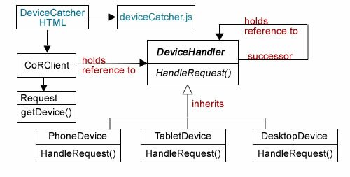
Figure 1: Chain of Responsibility Implementation
In Part I of this series, you can see how the device width and height is determined using a JavaScript closure (object) to pass the information to HTML and on to PHP. Since we only need to find the width, the JavaScript code has been slightly altered and placed in a separate file (deviceCatcher.js) in case it needs to be reused.
//deviceCatcher.js function getWide() { var wide = screen.width; return function() { return wide; } } var w = getWide(); //Send data to PHP class, CoRClient.php var lambdaPass= function() {window.location.href = "CoRClient.php?hor=" + w();}; |
The HTML file simply calls the closure function which passes the values to PHP:
|
The HTML file is a trigger to get the ball rolling with the client class (CoRClient).
Starting the Chain
The client pulls the viewing device’s width from the superglobal, and passes it to a PHP variable. Given the variability in the width of device screens, I made the decision to work with three sizes to get started: 1) phone, 2) tablet, and 3) desktop. So, depending on the width, the request would be handled by one of those three device groups. I used the following cutoff sizes:
- Phone: >= 480
- Tablet: >=481 and < 900
- Desktop: >= 900
I used this table as a guide, but cutoff points can be anything you want.
Getting the width from the superglobal is easy enough using a static variable:
self::$wide=$_GET['hor'];
The, using the cutoffs, the program needs to generate three strings, phone, tablet, and desktop to send to the Request class that stores the appropriate string. The most obvious way is to use conditional statements (if or switch) to generate the correct string for Request. For example an imperative algorithm such as the following would do the trick:
if(self::$wide < = 480) { return "phone"; } elseif (self::$wide >= 900) { return "desktop"; } else { return "tablet"; } |
However, a functional program would be more compact, and like the JavaScript closure used in Part I, it would be an “object.” Transformed into a functional closure, the operation would look like the following:
$beta = self::$wide >= 900 ? 'desktop' : 'tablet'; $lambda = function($x) use ($beta) { $alpha = $x < = 480 ? 'phone' : $beta; return $alpha;}; |
Using ternary operations ?: , $alpha and $beta both have function-like qualities. for example, $beta could have been written as a function beta() as shown in Figure 2:
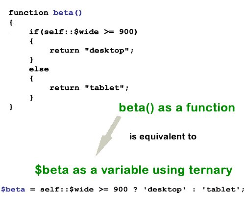
Figure 2: “Functional” variables
As you can see in Figure 2, $beta provides the same functionality as beta(), and $beta can be used as a reference in the $lambda function along with $alpha in a PHP closure. (For some reason, when $beta is assigned an anonymous function, I was unable to get it to be added as a closure in the $lambda anonymous function.)
Continue reading ‘Sandlight CMS II : Mobile First!’
 Why ‘Near’ Strategy?
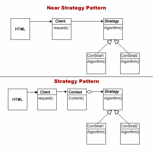
 I was very sorry when I found out that your intentions were good and not what I supposed they were. — Sitting Bull after the Battle of Little Big Horn
 What are the causes of System Redesign?
 Which Design Pattern?
Recent Comments